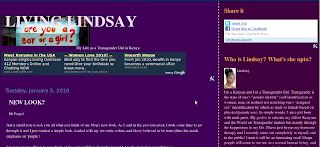
Just a small note to ask you all what you think of my blog's new look. As I said in the previous post, I took some time to go through it and I just wanted a simple look, loaded with my favourite colors, and those believed to be trans (thus the much emphasis on 'purple')
I'm just curious. What do you think of the colors? What about the layout? Are the fonts big enough? e.t.c.
Thanks my friends.
**Vivre Et Laisser Vivre**

4 comments:
Like the color, though the main blog text should be a bit brighter, like white instead of purple, so it's easier to read.
I've never been fond of ads in my blog and hear they don't pay enough. So I just keep my readers away from ads.
Love the new pic at the top"!
Thanks Lori.
Why purple though? I know its striking, but...mmmh, I would've chosen something different for the background, something lighter and brighter.. But hey, purple is fine too.
Lol, I know what I've said doesn't make much sense, but there you go.. :)
Anengiyefa, I love purple. Plus I wanted a dark background like the one I had before. It might change to a darker shade of blue but that's for another time.
Thanks though. Means alot.
Post a Comment